bengarves.com/work/filter-x-filter-module
Filter x Filter Module
[SEO-95] Topics Page - New "FilterXFilter" Module
From Ben Garves’s work at Udemy. Re-created from the original document, with people’s names, internal links and non-public numbers removed or generalized. Sections by others are labeled.
StorySEO-95
- Company
- Udemy
- Created
- Resolved
- Status
- Done
- Priority
- P1 - High
- Story points
- 5
- Epic
- Topic Page v2
- Project
- SEO Squad
- Sprints
- SEO Sprint 5, SEO Sprint 6
- Requirement source
- Engineering
Asks engineering to build a new Topic page module of four pre-filtered course-collection cards, so visitors can jump straight to a filter preset that matches their needs. Includes design specs for desktop and mobile, responsive wrapping rules and click behavior.
- Topic pages
- Content modules
- Faceted search
- Responsive design
User story
As a Topic page visitor, I'd like a module that presents me with pre-filter options so that I can quickly navigate to a filter preset that more closely matches my needs.
Context
We'll provide the copy and links on a per-page basis in a future ticket, but this initial request will be to build the shell.
![Early concept of a module titled “Popular [topic] course collections for learners like you,” with four pastel cards that each pair two filters, such as “Prompt engineering, Intermediate learners” or “Top-rated, Under 3 hours,” over a one-line description and a placeholder course count.](/media/work/filter-x-filter-module/p2-1.png) (full-size image)
(full-size image)Acceptance criteria
- This module has been built in a way that can be pulled into the v2 Topic template (built in a separate ticket).
- Location on the template is still TBD, so don't worry about location, beyond placing it above the Course Directory (also built in a separate ticket).
- Designs can be found in Figma (the design comp is shown below).
Update from design
Added to the ticket by the design team.
The design team added detailed specs to the story (also in Figma). Some styles may change as we finalize, but overall functionality and data will remain the same.
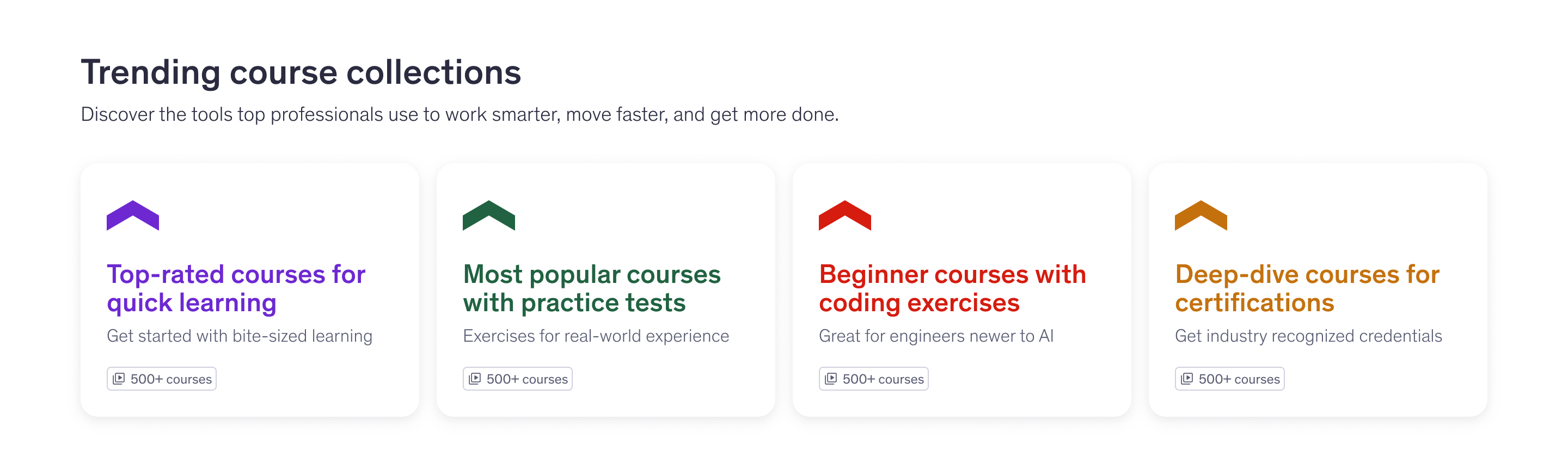 (full-size image)
Desktop specs (XXL to M breakpoints, 1340+ to 701px)
Part of the design team’s update.
- Module
- Horizontal padding for module: maintain site-wide page margins (24px minimum)
- Vertical padding for module: 48px (space-xl)
- Horizontal gap between cards: 16px (space-sm). If 2 rows, vertical gap between cards: 16px (space-sm)
- Title block
- Title: Udemy Sans, Heading, 32px (HeadingSans/XXL), applied/text/default (#2A2B3F)
- Subtitle: Udemy Sans, Regular, 18px (Text/Large), applied/text/default (#2A2B3F); max-width 800px, break to a second line as needed
- Vertical gap between title and subtitle: 8px (space-xs)
- Vertical gap between title block and collection cards: 32px (space-lg)
- Collection cards
- BG: applied/background/default (#FFFFFF); corner radius: border/radius/large (16px); drop shadow: BoxShadow100
- Width: 3 column span (311px at XXL/1292px), minimum width of 240px + minimum 2 cards per row
- If cards would scale below 240px on a single row, they should break to 2 cards per row and auto-scale to fit width. Cards seem to scale below 240px at ~1054px browser width, so assume they break to 2 rows around there
- Height: hug content; the tallest card should set the height of all cards in the row
- Individual cards
- Vertical and horizontal padding: 24px (space-md)
- Vertical gap between icon and title: 16px (space-sm)
- Vertical gap between title and subtitle: 4px (space-xxs)
- Vertical gap between subtitle and meta: 16px (space-sm) minimum; should auto-scale with card height so the meta is always bottom-aligned
- Icon: 48x48px (Icon/X-Large), center aligned; Uptick; top-left aligned in card (not yet an icon, SVG/PNG exportable). Color depends on the card (4 possible combos, randomly assigned): purple, applied/icon/link (#6D28D2); green, applied/icon/positive (#206241); red; and orange (#C4710D)
- Title copy: Udemy Sans, Heading, 24px (HeadingSans/XL). Color depends on the card, using the same 4 combos: purple, applied/text/link (#6D28D2); green, applied/text/positive (#206241); red; and orange (#C4710D)
- Description copy: Udemy Sans, Regular, 16px (Text/medium), applied/text/subdued (#595C73)
- Meta (should be the standard meta pill): course count, Udemy Sans, Heading, 12px (Text/XS), applied/text/subdued (#595C73); icon 16x16px (Icon/XS), "video-group", applied/icon/subdued (#595C73). Will be hard-coded and approximate for the V1 launch, e.g. 500+ courses
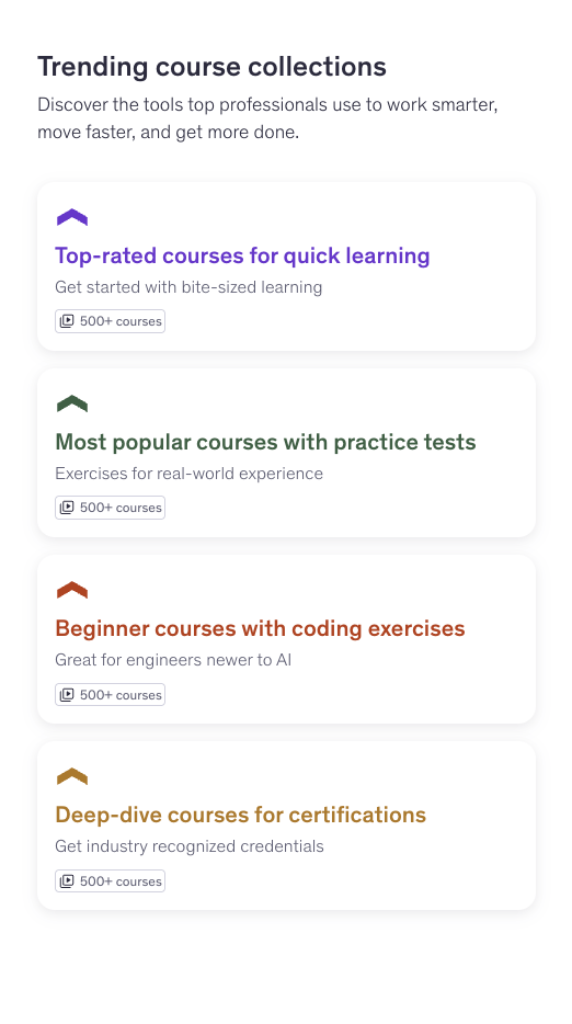
Mobile specs (S to XXXS breakpoints, 700 to 0px)
Part of the design team’s update.
Only changes are documented; everything else should follow the desktop specs above.
- Collection cards
- Width: scale to fit / 2 column span (318px at S/700px), minimum width of 220px
- If 2 cards would scale below 220px on a single row, all cards should break to their own row
- Height: hug content; the tallest card should set the height of all cards in the row
- Horizontal gap between cards: 16px (space-sm); vertical gap between cards: 16px (space-sm)
- Individual cards
- Vertical and horizontal padding: 16px (space-sm)
- Vertical gap between icon and title: 8px (space-xs)
- Vertical gap between subtitle and meta: 8px (space-xs) minimum; should auto-scale with card height so the meta is always bottom-aligned
- Icon: 32x32px (Icon/Large), center aligned in icon container; Uptick; top-left aligned in card (not yet an icon, SVG/PNG exportable)
Hover states and behavior
Part of the design team’s update.
- Hover: card BG should change to applied/background/pale (#F6F7F9) and the drop shadow changes to BoxShadow300
- On click/tap: the user should be taken to a pre-filtered Search Results Page (TBD if we will add a back-to-topics CTA OR open in a new tab)
- TBD behavior for the SRP (will confirm the week of 6/22)
- Add a title reflecting the query/topic to the top of the SRP
- On the existing filters version, add the course count to the title; the new design-system filters account for course count below the filters
- User should see their query reflected in the search bar. Not critical if we're able to pre-populate the search bar
- Filter bar should reflect the filters that are applied. If we are able to show an "exposed" version of an included filter, that is ideal
- Add a back-to-topics link that would drop the learner back on the topics page, and should maintain page placement if possible
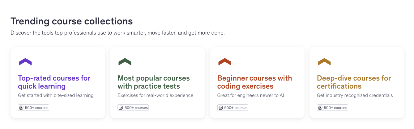
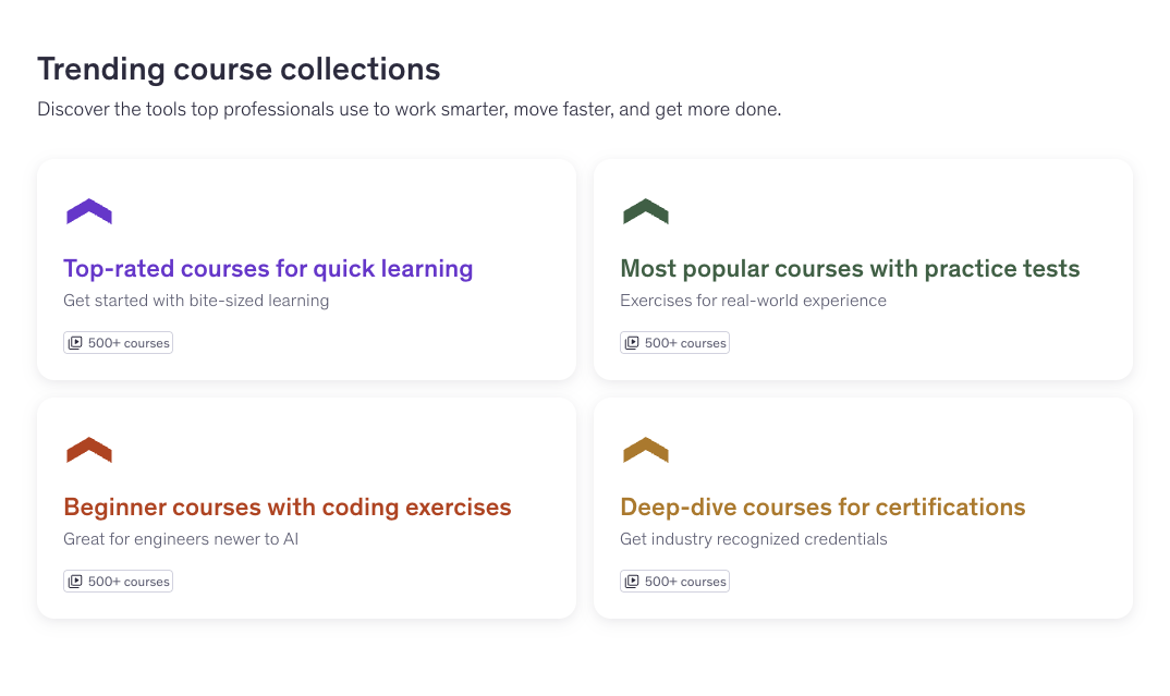
Responsive behavior in testing
Summarized from the engineer’s and designer’s comments on the ticket, with screenshots from the engineer’s test build.
Build note
In testing, the cards reached the 240px and 220px minimums at different browser widths than the breakpoints named in the spec, which raised the question of which should take priority. Design confirmed that the minimum card widths should decide when the cards wrap.
 (full-size image)
 (full-size image)
 (full-size image)